Shop
DreamUp AI Art
DreamUp
Join
Log In
User Menu
Upgrade to Core
Theme
Display Mature Content
Suppress AI Content
Get Help and Send Feedback
Terms of Service
Privacy Policy
Submit
Deviation
Submit your art
Upload your creations for people to see, favourite, and share.
DreamUp
Turn your dreams into reality
Generate your own AI work.
Status Update
Post an update
Tell the community what’s on your mind.
Journal
Post a journal
Share your thoughts, experiences, and stories behind the art.
Literature
Submit your writing
Upload stories, poems, character descriptions & more.
Subscription
Get your fans' support
Fund your creativity by creating subscription tiers.
mayshing on DeviantArt
https://www.deviantart.com/mayshing/art/Making-Manga-2-1427670
mayshing
Deviation Actions
Add to Favourites
Comment
2.5K
Favourites
IN The Rain
mayshing
$1.25
100
Download
More by
mayshing
Watch
mayshing on DeviantArt
https://www.deviantart.com/mayshing/art/Making-Manga-1427661
mayshing
mayshing on DeviantArt
https://www.deviantart.com/mayshing/art/Making-Manga-3-1427678
mayshing
mayshing on DeviantArt
https://www.deviantart.com/mayshing/art/Making-Manga-7-1427709
mayshing
mayshing on DeviantArt
https://www.deviantart.com/mayshing/art/Making-Manga-5-1427688
mayshing
mayshing on DeviantArt
https://www.deviantart.com/mayshing/art/Making-Manga-8-1427722
mayshing
mayshing on DeviantArt
https://www.deviantart.com/mayshing/art/Making-Manga-6-1427699
mayshing
mayshing on DeviantArt
https://www.deviantart.com/mayshing/art/Making-Manga-9-1427732
mayshing
mayshing on DeviantArt
https://www.deviantart.com/mayshing/art/Angel-2-159921404
mayshing
mayshing on DeviantArt
https://www.deviantart.com/mayshing/art/Anime-Art-lesson-Speedlines3-1475862
mayshing
Suggested Deviants
Hellobaby
Watch
Hellobaby on DeviantArt
https://www.deviantart.com/hellobaby/art/Eyes-s-coloring-Tutorial-119240736
Hellobaby
Hellobaby on DeviantArt
https://www.deviantart.com/hellobaby/art/Face-tutorial-119121212
Hellobaby
Hellobaby on DeviantArt
https://www.deviantart.com/hellobaby/art/Hair-tutorial-85555838
Hellobaby
pandabaka
Watch
pandabaka on DeviantArt
http://creativecommons.org/licenses/by-nc-sa/3.0/
https://www.deviantart.com/pandabaka/art/How-I-making-manga-part-1-108305172
pandabaka
pandabaka on DeviantArt
https://www.deviantart.com/pandabaka/art/how-to-screentone-for-begining-25678070
pandabaka
pandabaka on DeviantArt
https://www.deviantart.com/pandabaka/art/manga-bg-from-real-photo-31006267
pandabaka
ArtistsHospital
Watch
ArtistsHospital on DeviantArt
https://www.deviantart.com/artistshospital/art/Making-Manga-Tutorials-94911011
ArtistsHospital
ArtistsHospital on DeviantArt
https://www.deviantart.com/artistshospital/art/Library-reference-Anime-Manga-24740728
ArtistsHospital
ArtistsHospital on DeviantArt
https://www.deviantart.com/artistshospital/art/Lib-Ref-Traditional-Inking-65870600
ArtistsHospital
Suggested Collections
Comic How-To's
mayshing on DeviantArt
https://www.deviantart.com/mayshing/art/Anime-Face-Subtlety-tutorial-361569230
mayshing
mayshing on DeviantArt
https://www.deviantart.com/mayshing/art/Anime-art-lesson-eye-list-1-1475717
mayshing
mayshing on DeviantArt
https://www.deviantart.com/mayshing/art/Anime-Art-lesson-speedlines2-1475853
mayshing
Tutorials
pandabaka on DeviantArt
http://creativecommons.org/licenses/by-nc-sa/3.0/
https://www.deviantart.com/pandabaka/art/How-I-making-manga-part-2-133393223
pandabaka
JaneMere on DeviantArt
https://www.deviantart.com/janemere/art/Lighting-747910585
JaneMere
Asfahani on DeviantArt
https://www.deviantart.com/asfahani/art/Ornamental-inking-294405459
Asfahani
reference
TysonTan on DeviantArt
http://creativecommons.org/licenses/by-sa/3.0/
https://www.deviantart.com/tysontan/art/Krita-Free-Painting-App-Tutorial-466497166
TysonTan
sandara on DeviantArt
https://www.deviantart.com/sandara/art/Abandoned-Station-steps-485883788
sandara
powerman2000 on DeviantArt
https://www.deviantart.com/powerman2000/art/Leg-Tutorial-176501868
powerman2000
You Might Like…
pandabaka on DeviantArt
http://creativecommons.org/licenses/by-nc-sa/3.0/
https://www.deviantart.com/pandabaka/art/How-I-making-manga-part-1-108305172
pandabaka
ArtistsHospital on DeviantArt
https://www.deviantart.com/artistshospital/art/Making-Manga-Tutorials-94911011
ArtistsHospital
enchantma on DeviantArt
https://www.deviantart.com/enchantma/art/Manga-Making-Tutorial-20758391
enchantma
enchantma on DeviantArt
https://www.deviantart.com/enchantma/art/ALL-NEW-Manga-Tutorial-92792590
enchantma
TheEclipse on DeviantArt
https://www.deviantart.com/theeclipse/art/Manga-shading-34898495
TheEclipse
Kita-Angel on DeviantArt
https://www.deviantart.com/kita-angel/art/Manga-Tutorial-Part-1-158659533
Kita-Angel
Kita-Angel on DeviantArt
https://www.deviantart.com/kita-angel/art/Manga-Tutorial-Part-2-158789820
Kita-Angel
AliTheBandit on DeviantArt
https://www.deviantart.com/alithebandit/art/Drawing-Manga-Pages-Tutorial-72587355
AliTheBandit
Fiona-Maria on DeviantArt
https://www.deviantart.com/fiona-maria/art/Planning-Manga-Tutorial-178394590
Fiona-Maria
Featured in Groups
See All
New-Anime-Artists
DeviantAnimeArtists
ImaginationAnimation
Making Manga 2
By
mayshing
Watch
Published:
Mar 7, 2003
402
Favourites
35
Comments
37.9K
Views
Description
Last
|
Next
|
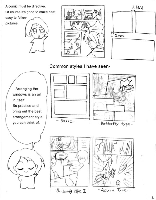
Just thought to post this here.... Bits and pieces of information I have learned about how to make a manga.....
Image size
600x768px 94.72 KB
© 2003 - 2024
mayshing
Comments
35
Join the community
to add your comment. Already a deviant?
Log In
litanurnalita
Feb 14, 2014
Whoa!! Great explanation!!
Reply
Load more