deviant art

Deviant Login Shop  Join deviantART for FREE Take the Tour
[x]
Download Image
JPG, 800×2255
more ▶

More from =mayshing

Featured in Groups:

Details

July 1, 2006
461 KB
800×2255
Link
Thumb

Statistics

Comments: 10
Favourites: 37 [who?]

Views: 1,908 (0 today)
Downloads: 296 (0 today)
[x]
:iconmayshing:
It's a progress of my painting.
As promised to to display it more step by step on my next deviantion.

An irresponsible tutorial(?) XD

See result here: [link]
Add a Comment:
 
:iconkidoairaku:
ahahaha, i agree with cutiekidd, you make it look so easy indeed.. but yes... lots of effort has been put into this kind of result...

anyways, thankyou muchly for this ^__^
i'm still amazed at this kind of artwork... without lines and everything
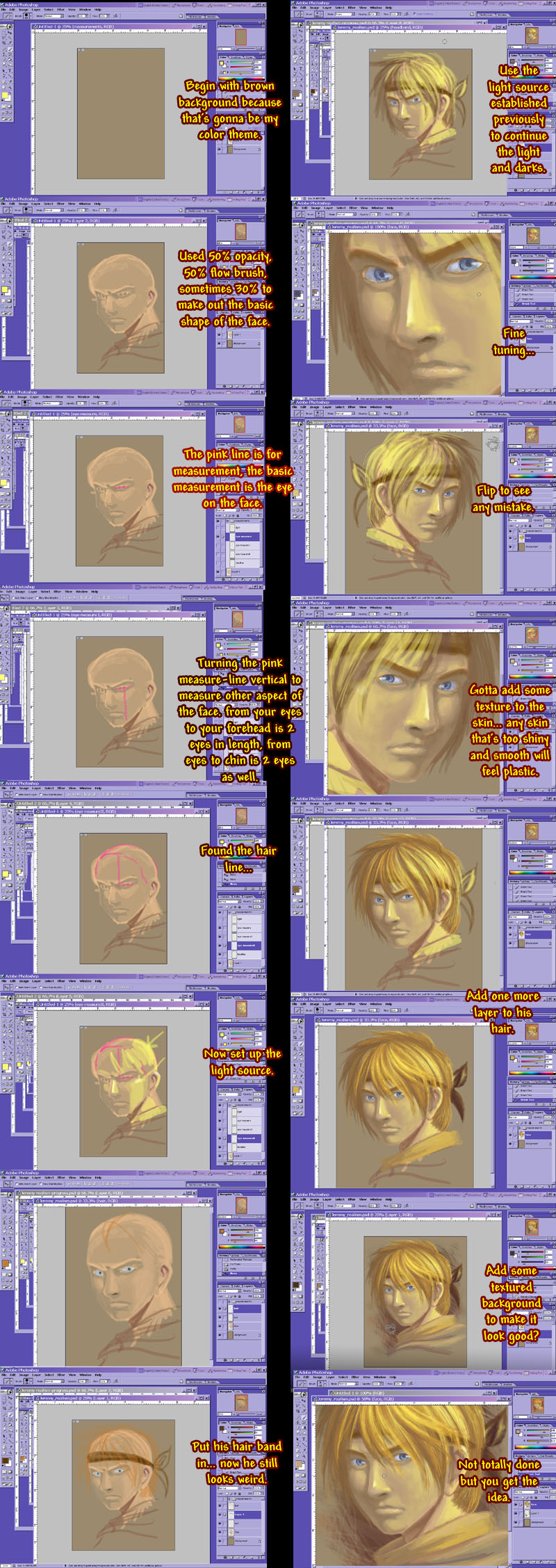
*sigh* wow... it's just so interesting to see how much the end result changes from what it first begins as...

how do you decide what colors to be used?
Reply
:iconmayshing:
=mayshing Jul 6, 2006  Professional Filmographer
"how do you decide what colors to be used?"

Killer question...
If you do traditional painting, you will know the answer to this question. For painting, you mix your own colors, some may apply the colors raw, but most prefer to mix their own color. It's the same with computer digital art. If you feel like your content fits the cool theme, you choose cool colors to start with. If you feel it fits the warm, start with the warm.

In this case, I wanted to make warm lighting because it makes a person feel more lively. And brown is Jeremy's designed color theme in 2Masters, so I used it.
For choosing colors you can choose harmony or contrast. Usually starting with harmony and end with contrast leads to a good picture in most cases.

Western style oil painters tend to only use one spot for focal point to start off the composition, with this piece, the focal point was where the highest contrast is. Which should be his hair and eyes. The hair direct alot of the visual movments, so it's critical for the hair to have enough contrast to carry the whole piece.
Reply
:iconkidoairaku:
i see i see ^__^b
thanks for your time explaining
Reply
:iconshintei-chan:
~Shintei-chan Jul 3, 2006  Hobbyist Digital Artist
wow...looks good...
nice proces
Reply
:iconcutiekidd:
O.O wow....
u make it seem so easy
Reply
:iconmayshing:
=mayshing Jul 2, 2006  Professional Filmographer
It's still lots of years of study, understanding the materials and pay attention to how things are done. Those memories embedded in the brain will make complex works seem effordless, but it's earned with alot of efford.
Reply
:iconcutiekidd:
:nod: just like regular traditional drawing...
Reply
:iconsharkbyte3827:
:applaud: Yes isn't painting in Photoshop FUN <D. It's always great to see the progess of an artists work and this is a good example. I like that there is a realistic approach to anime, I have been doing that myself lately and yours looks just as good. I thought it was a good trick that you flipped your work to find any problems, I have to do that more often with my own work.
Reply
:iconnikki0417:
~Nikki0417 Jul 1, 2006  Student General Artist
looks great!^_^ I love the shading. :D the proportions are pretty good, too.^^ I could never start a pic without some sketch. XD
Reply
:iconmayshing:
=mayshing Jul 1, 2006  Professional Filmographer
this is sort of a CG sketch. lol~
Reply
Add a Comment: